Back to Projects
Old Blood Orch Ale
A packaging and illustration case study following the label from early linework through final production-ready mockups.

01 / Sketch foundation — the first pass establishes the orc’s silhouette, expression, and label composition before color or packaging details are introduced.

02 / Color and label system — the illustration is pushed into a high-contrast palette, balancing character impact with typography, warnings, brewery marks, and shelf readability.

03 / Mockup testing — the flat label is tested on can forms and real-world scenes to check legibility, scale, and how the character reads under product photography.
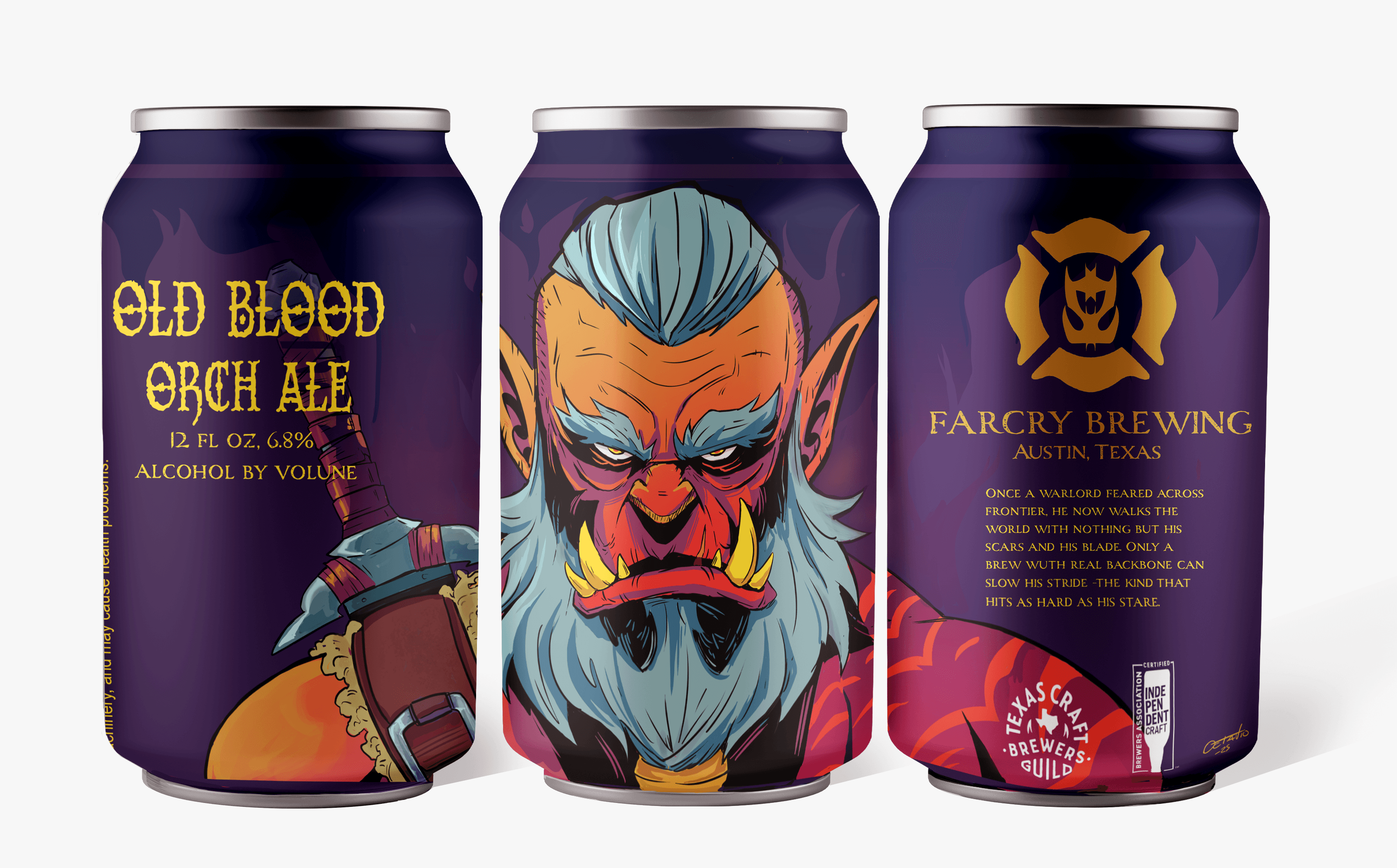
04 / Final design — the finished presentation combines character illustration, brand marks, regulatory copy, and production artwork into a cohesive beer label system.